
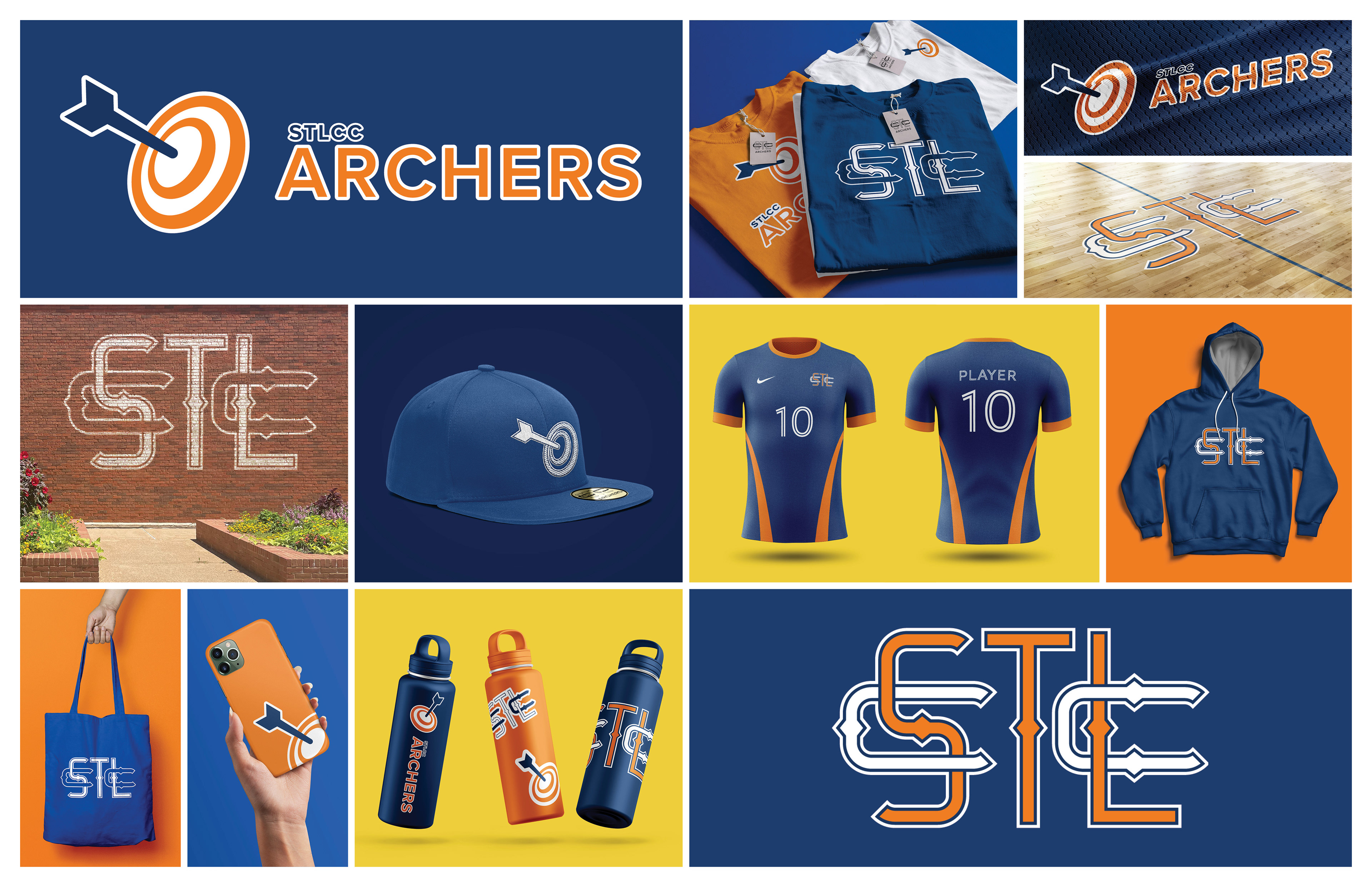
The Archers are the proud sports team of St. Louis Community College. Whether it's baseball, basketball, soccer or volleyball, the Archers are ready to bring their A-game; however, I don't believe their current logo lives up to the esteemed Archer name.
I wanted to create a brand identity that shows that the Archers are always on-target.

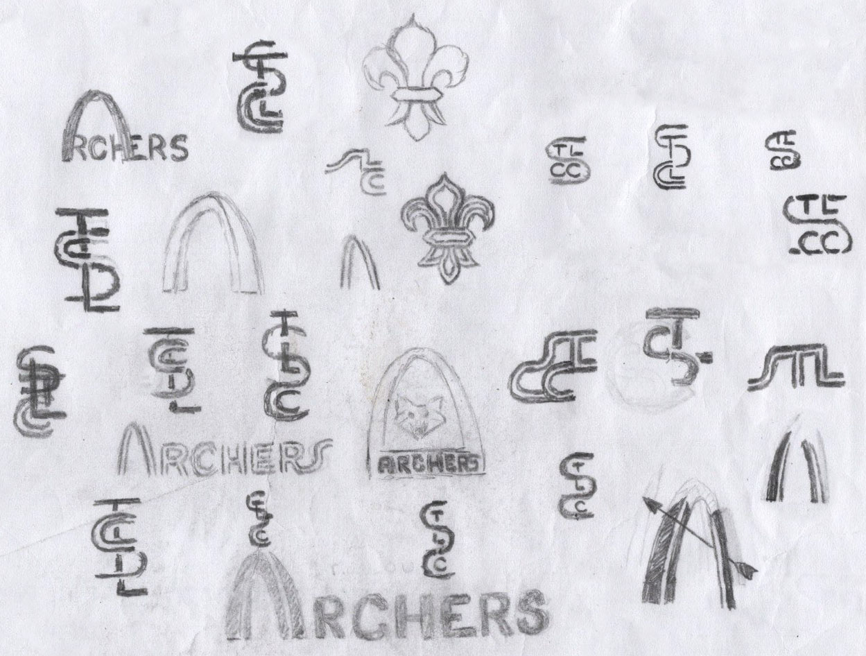
When starting this redesign, I looked to the Archers' namesake, the Gateway Arch,
for inspiration. What I had in mind was a shield with a simple, abstract illustration
of the beloved St. Louis monument, with elements from STLCC's own brand:
double-lines and shades of blue. I also wanted to incorporate the fleur-de-lis
to reinforce the St. Louis identity. The inclusion of arrows was considered
as a nod to archery.

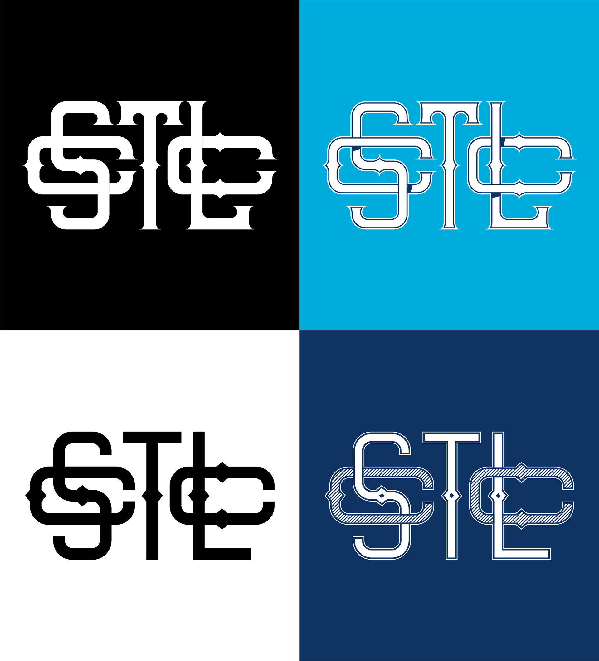
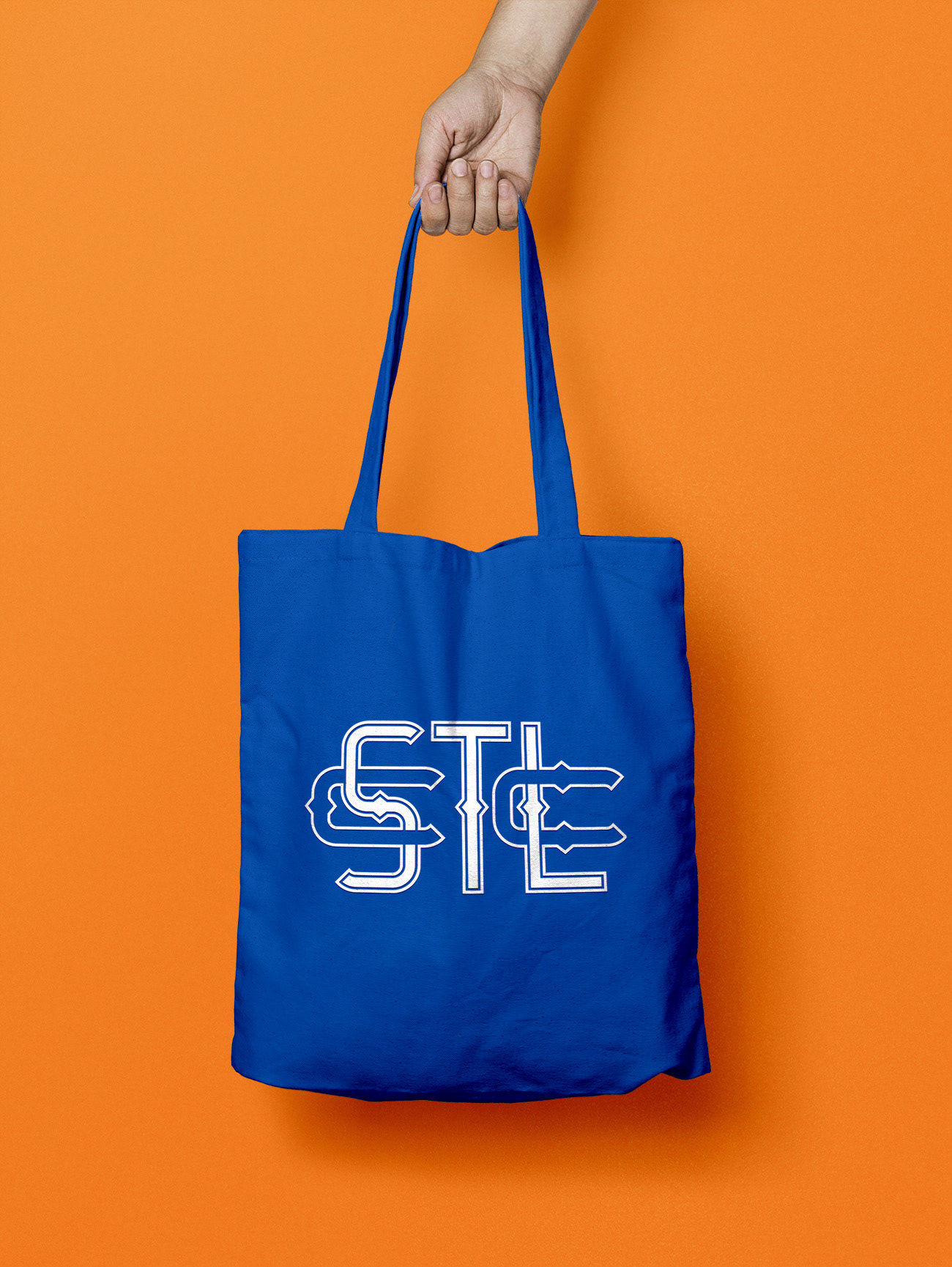
After some experimentation, I was not happy with these concepts and scrapped the idea of using the Gateway Arch. Afterward I started combining the letters in STLCC
in an attempt to create a lock-up similar to what can be found on St. Louis Cardinals merchandise.
in an attempt to create a lock-up similar to what can be found on St. Louis Cardinals merchandise.
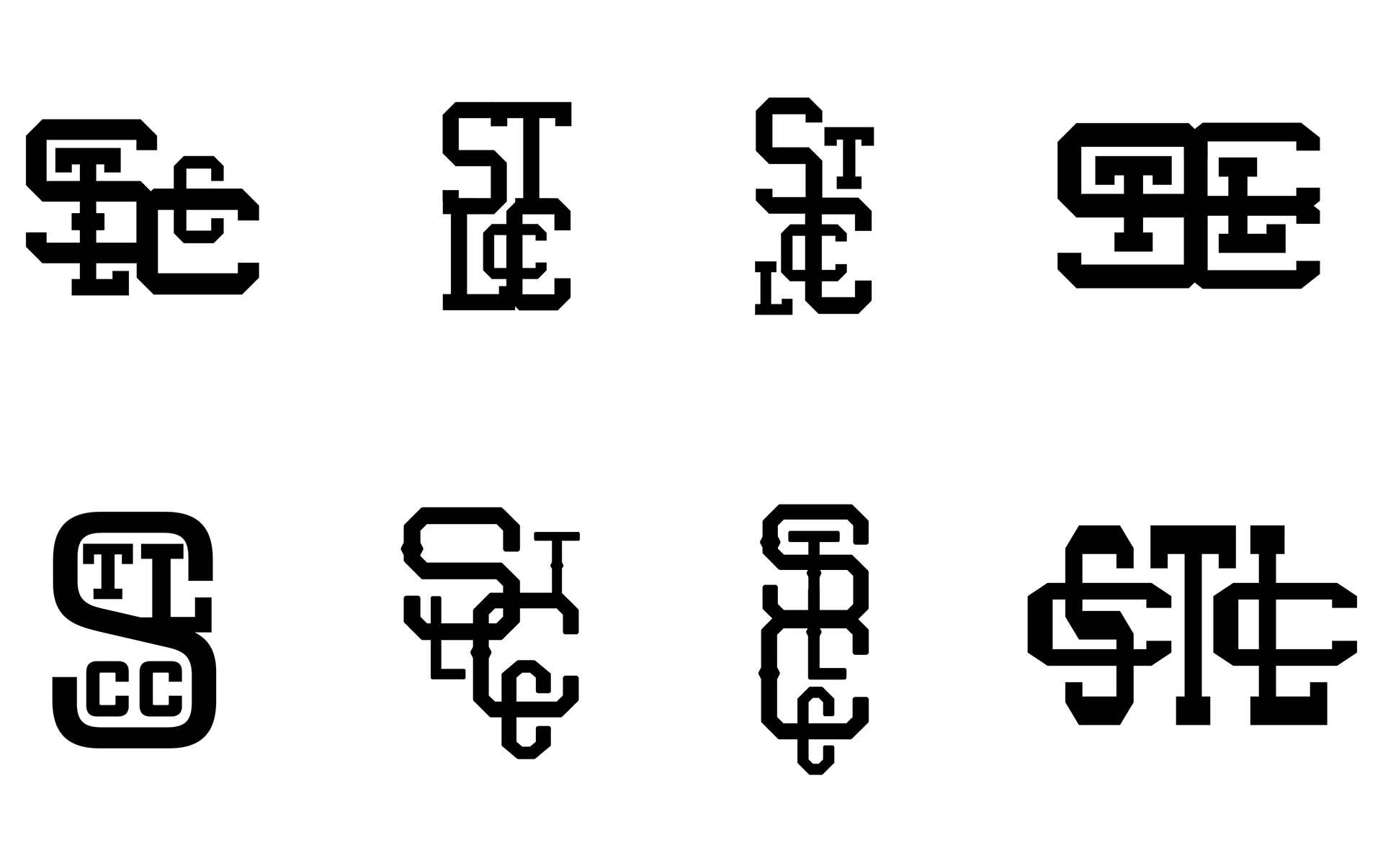
Among these iterations, the last one particularly stood out to me. I started refining
and polishing this version, adorning it with diamonds and making it less angular.
and polishing this version, adorning it with diamonds and making it less angular.
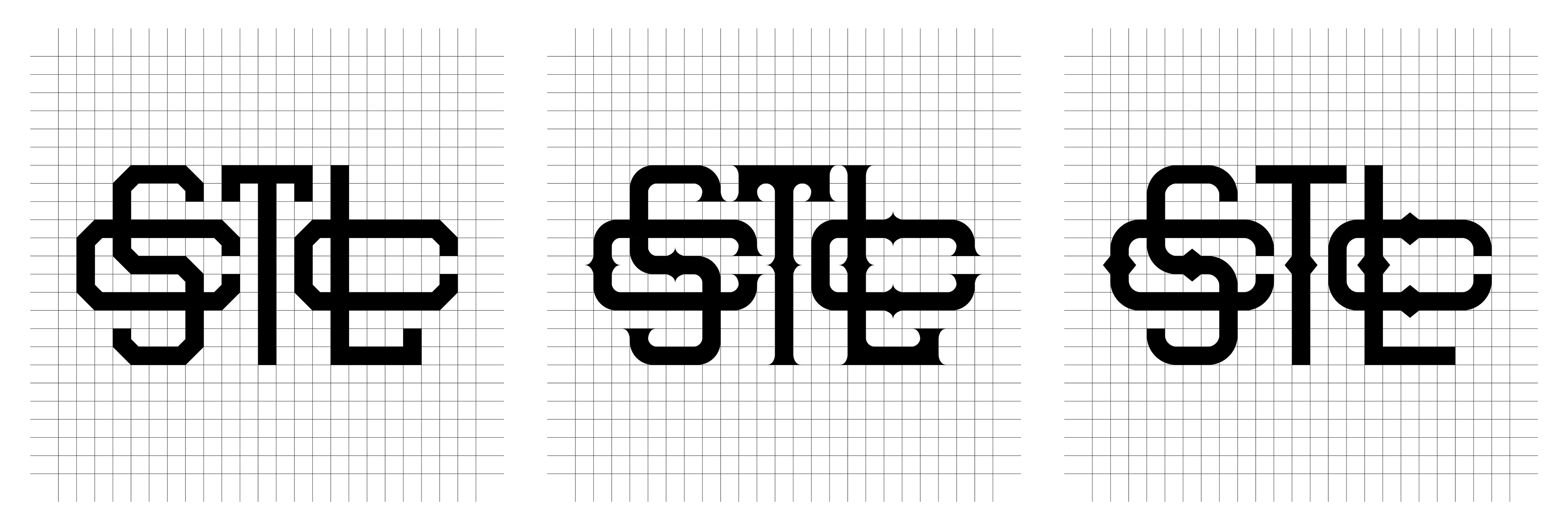
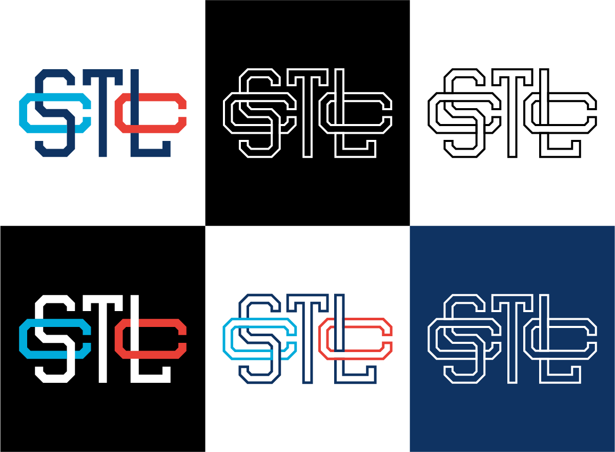
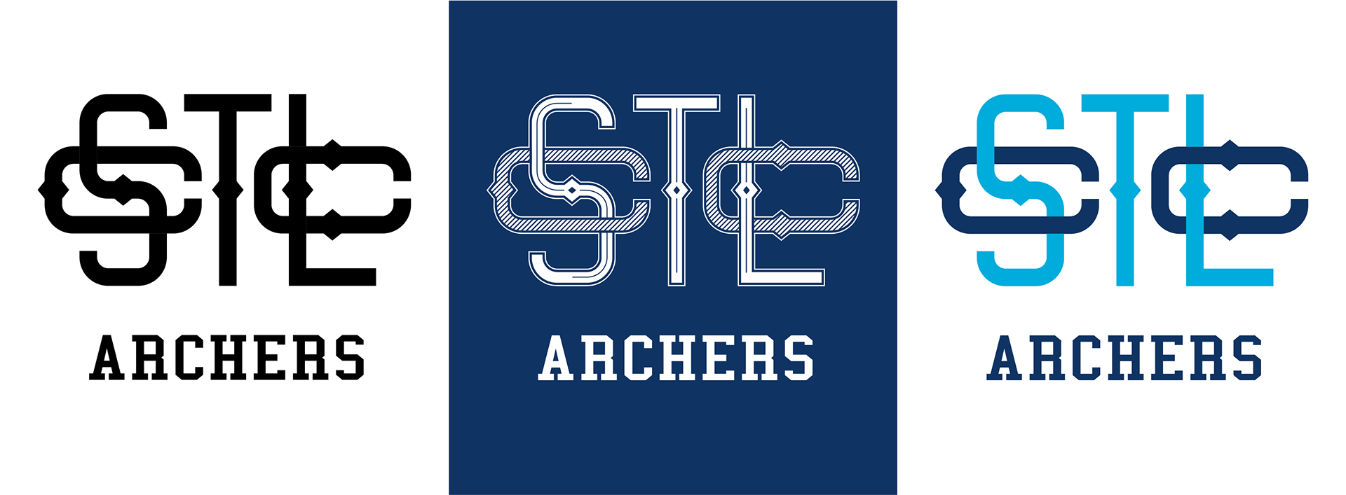
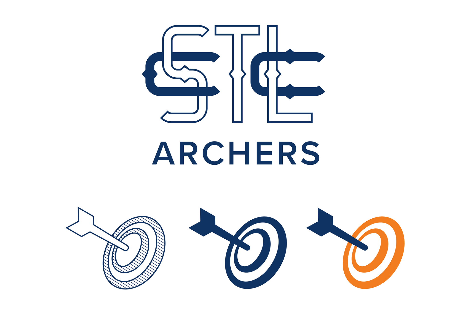
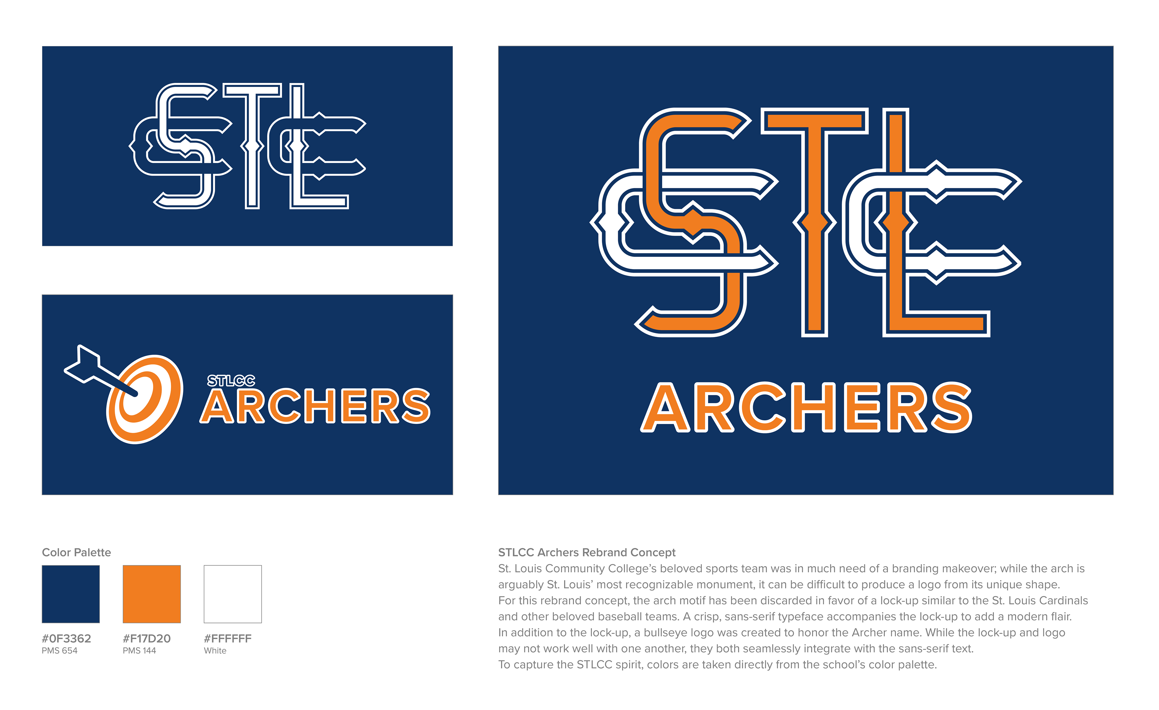
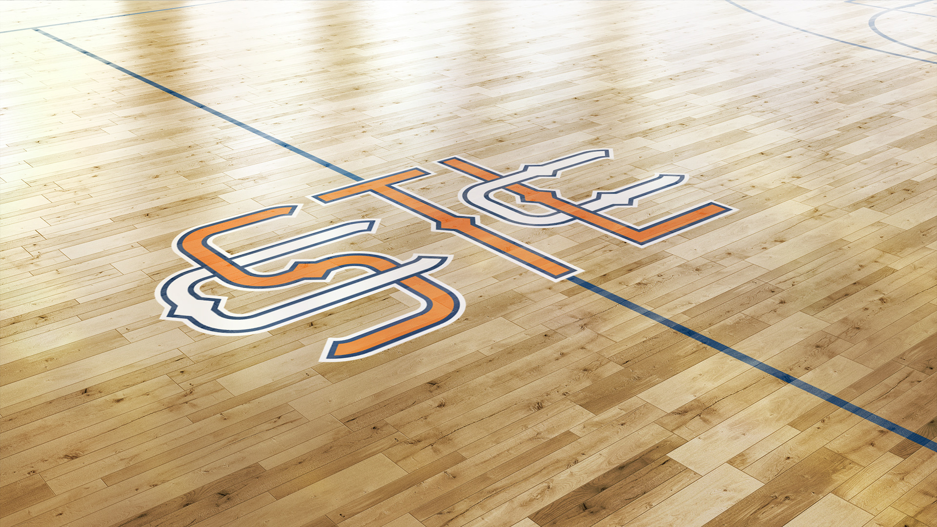
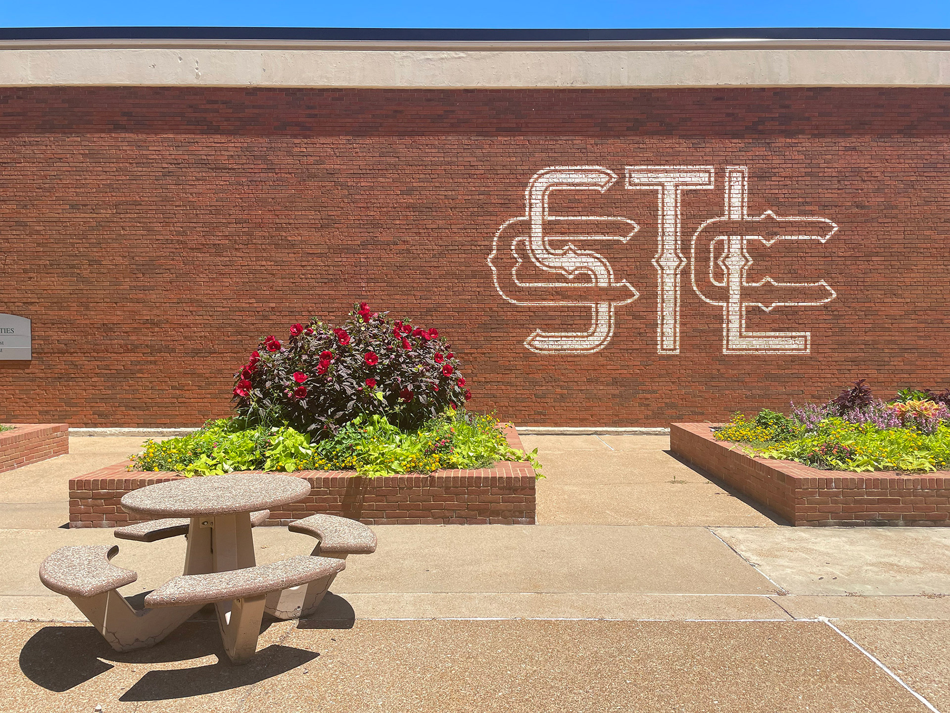
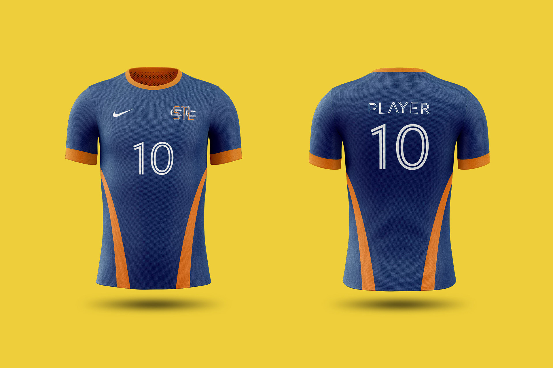
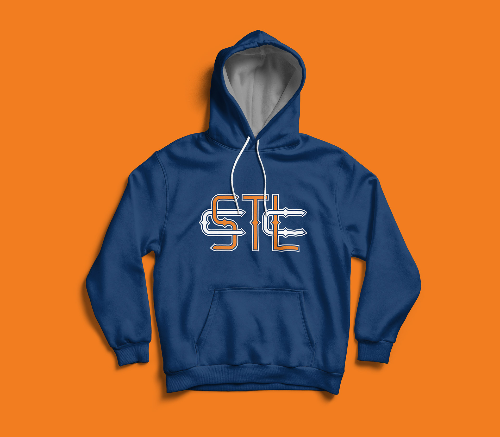
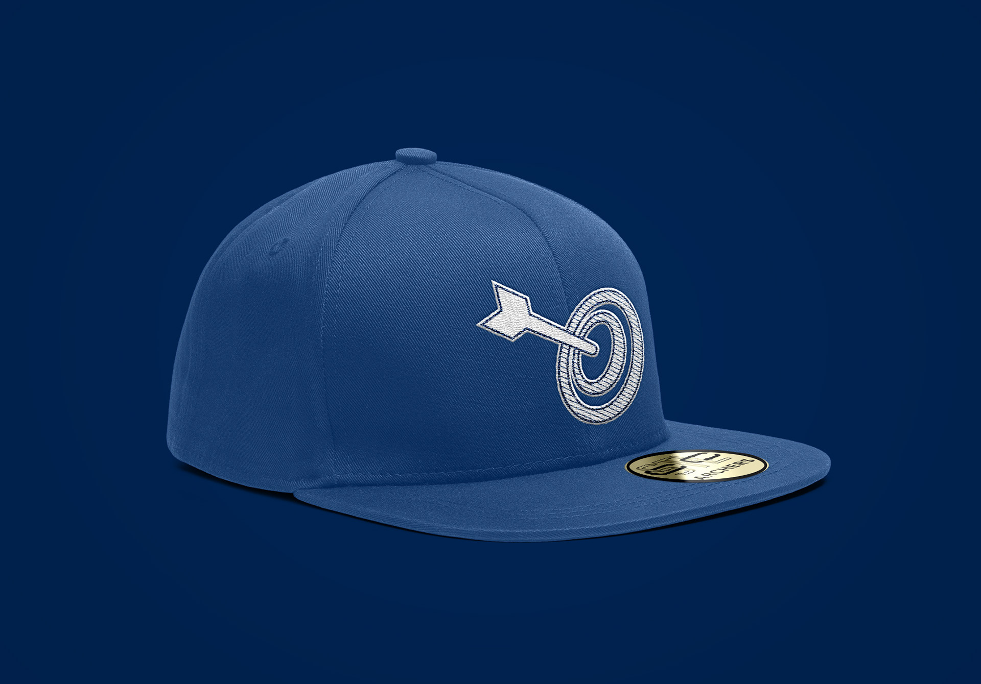
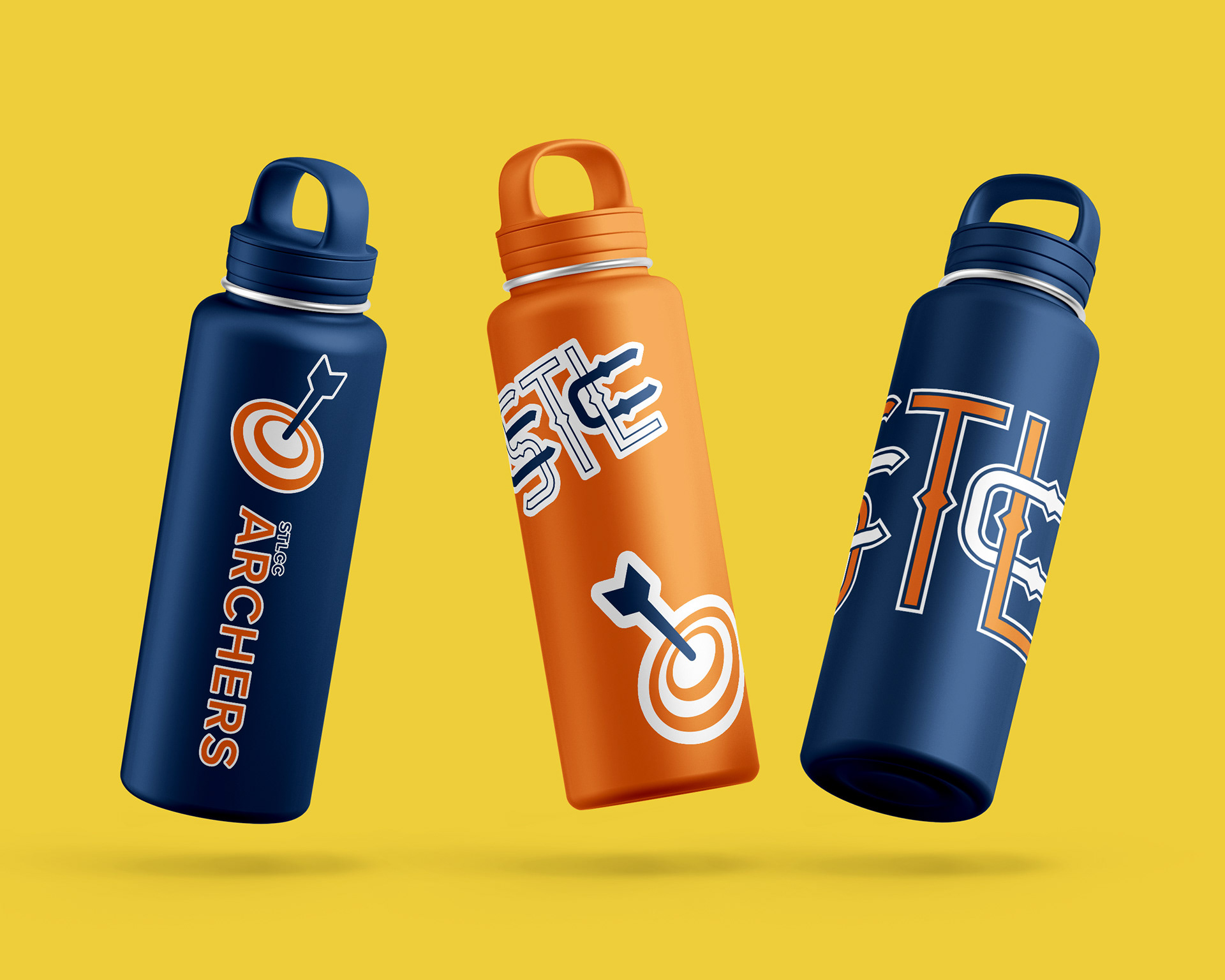
The end result was a logo that was simple, dignified and can be used in a multitude
of ways. In addition, a bullseye logo was created to give the team more identity.
While the lock-up and logo don't necessarily work well together, their intention is
to be used separately under different circumstances.
of ways. In addition, a bullseye logo was created to give the team more identity.
While the lock-up and logo don't necessarily work well together, their intention is
to be used separately under different circumstances.


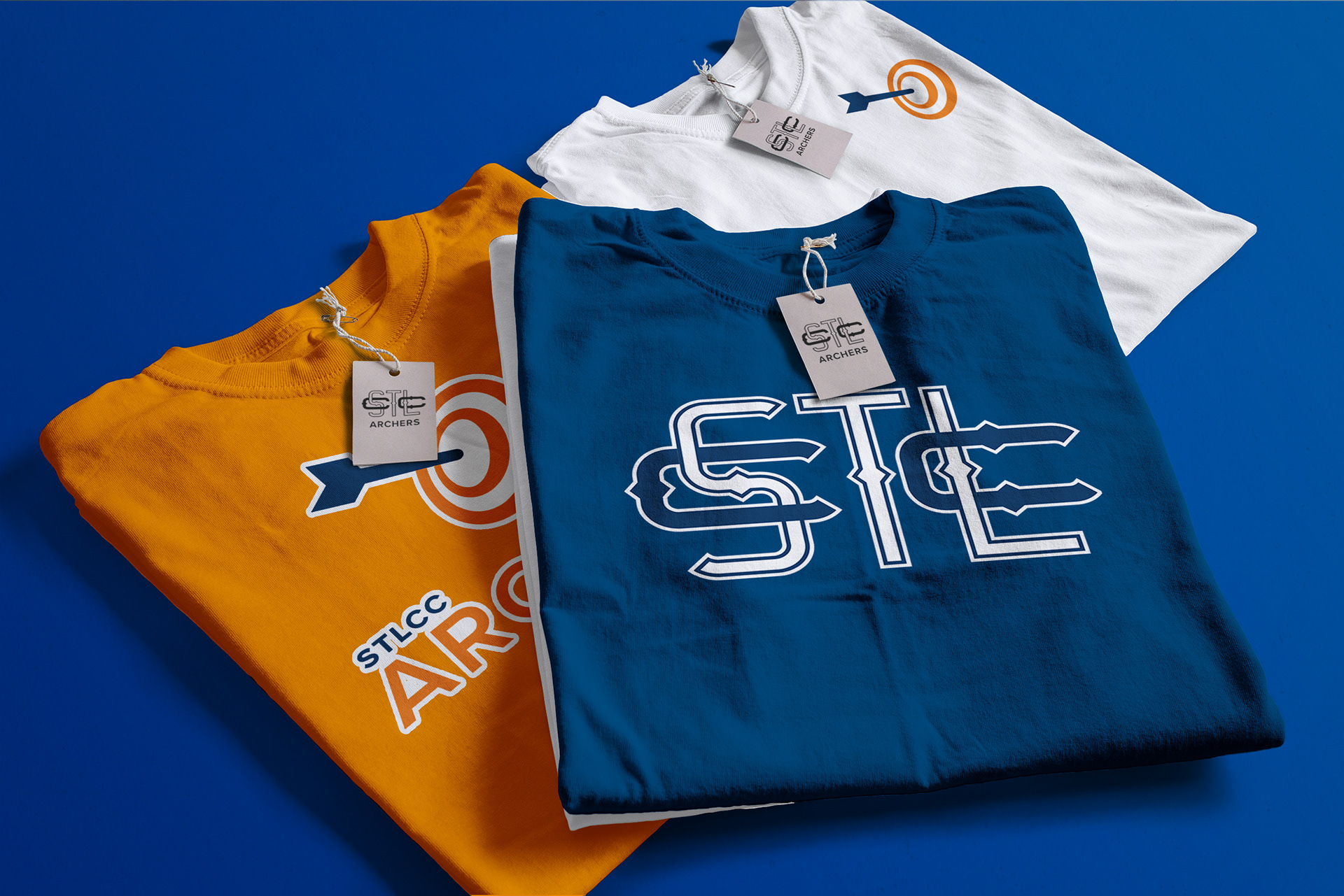

T-shirt mockup designed by graphicheroco on Freepik